


In this era of Artificial Intelligence (AI) our attention spans are getting shorter. At the same time, we are trying to consume more and more data. We don’t just want information, we want it to be clear, quick, and easy to manage. A Core App Dashboard comes in just at that point. Imagine it as a centralised interface that converts raw data into actionable insights in real time. A good core app dashboard is not only a display of metrics but a story. It directs the users, simplifies decision-making, and makes it more engaging. Intriguing, isn’t it? Let’s delve deeper into this for a better understanding.
What Is a Core App Dashboard?
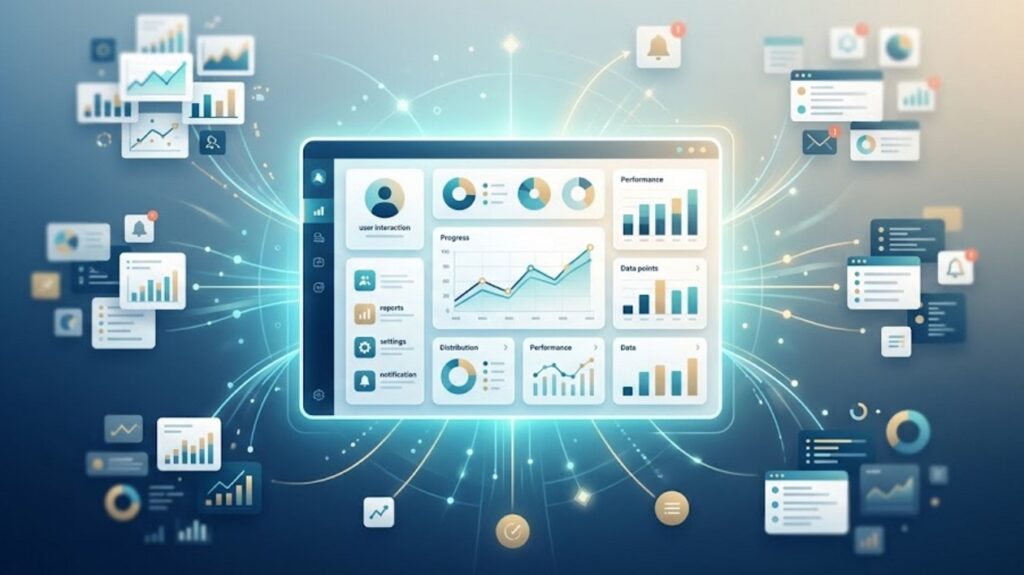
A Core App Dashboard is the main interface of an application where users can see important information, performance and interact with important features. It is a centralised point gathering the most significant information in a single accessible area. With this feature, users do not need to go through various parts of the app and lose their heads.
Instead of bombarding a user with bits and pieces of information, this dashboard takes the information and presents it in an understandable format. This enables users to quickly make sense of patterns and act without friction. The dashboard functions as an insight engine as well as a control panel. It assists users to keep up with the current events, make decisions at a faster rate and have control over their actions in the app.
The Importance of Core App Dashboards
Core App Dashboard is more than just a matter of aesthetics. It has a direct influence on the retention, usability, and overall satisfaction. This dashboard:
- Minimises the amount of information to process by simplifying complex information.
- Enhances productivity by reducing the number of clicks and navigation.
- Improves interest with interactive and personalised features.
- Helps in decision-making with clear and actionable insights.
In short, it helps to close the gap between the data and the user action.
Key Features of a High-Performing Core App Dashboard
If you want to create a valuable dashboard, it is necessary to pay attention to the aspects of functionality and user experience. All these elements work in harmony to make the dashboard informative, intuitive and captivating.
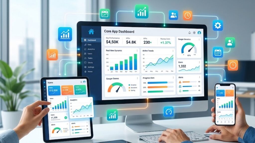
- Clear Data Hierarchy: A good performing dashboard prioritises information. Here, the most important metrics and KPIs are in the centre. Users can easily understand what is important, and the secondary details are still visible without causing clutter.
- Real-Time Updates: Core App Dashboards provide timely information to the users. Synchronisation of data in real time is important so that whatever they view is correct and relevant. This is more important in applications related to finance, operations or live tracking.
- Customizable Widgets: Personalisation enhances usability. Core App Dashboard provides users the ability to move and manipulate components, display metrics of their choice and do whatever they want with their layout. It gives users a more relevant and interactive experience that suits their unique preferences.
- Intuitive Navigation: A dashboard ought to be easy to operate. Rational structures, easy-to-understand menus and the same interaction patterns guide users to move with ease and without confusion.
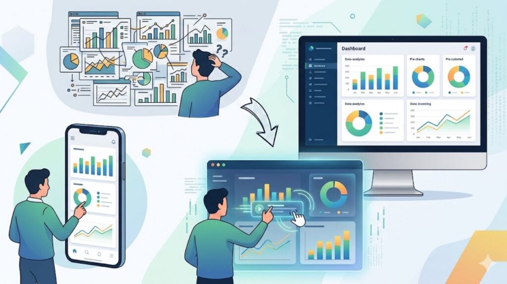
- Visual Data Representation: It makes Complex information easy to understand through data visualisation such as charts, graphs, and progress indicators. This enables users to derive insights instantly without having to process raw numbers.
- Responsive Design: The use of multiple devices is common nowadays. Core App Dashboard scales smoothly across screen sizes to make it easy. The responsive design provides a consistent performance and usability across mobile, tablet, and desktop platforms.
Types of Core App Dashboards
All dashboards are not equal. Different dashboards emphasise different types of data and insights depending on the use and purpose.
- Operational Dashboards: These dashboards focus on real-time monitoring and instant data updating. You can use these dashboards for monitoring running processes like system health, user activity or transactions.
- Analytical Dashboards: Analytical dashboards provide insights into historical data and trends. They assist in exploring data and allow users to discover patterns to make informed decisions.
- Strategic Dashboards: Strategic dashboards give an overview of long-term objectives and performance pointers. Executives tend to use them to measure success and fit in with the overall business goals.
- User-Centric Dashboards: These dashboards are user-specific, showing individualised information like tasks, progress, recommendations, or preferences to increase engagement and relevance.
Best Trends in the Core App Dashboard in 2026
The design of the dashboard is still developing as new technologies and user demands emerge. Being up to date with the trends can also provide your application with a competitive advantage.
- AI-Powered Insights: Dashboards are becoming more and more interactive with AI to offer predictive analytics and intelligent suggestions.
- Minimalist UI Design: Clear layouts and lots of white space allow users to concentrate on what is most important without a lot of distractions.
- Dark Mode Optimization: Increasing numbers of dashboards are providing dark colours to enhance readability and diminish eye discomfort.
- Micro-Interactions: Minor animations and transitions help to improve user experience and make interfaces more responsive.
- Voice-Enabled Dashboards: Voice commands are a new form of interacting with data, without the need to touch a device.
The way Core App Dashboards can enhance the User Experience
Any successful application centres on user experience, and the dashboard is an important element in designing the experience. A properly designed dashboard can minimise friction by showing the crucial information up front. It does not require the users to search to get insights, but provides them in an instant. This not only saves time but also makes the interaction more fulfilling and satisfying. Moreover, dashboards are crucial elements in improving UX by providing customisation. Users are more likely to be in control when they understand what they see, be it metrics, layouts or alerts and this results in deeper engagement and satisfaction.
Core App Dashboard Applications in Various Industries
The core app dashboards do not belong to a single domain. They are fundamental in a broad spectrum of industries with their own needs.
- Finance Apps: In this, the dashboard keeps track of spending, investment activities and financial wellbeing in real-time.
- E-commerce Platforms: The dashboard here shows sales performance, customer behaviour, and inventory insights.
- Healthcare Systems: In healthcare-related tools, this dashboard offers summaries of patient data, appointment tracking and analytics to medical professionals.
- Project Management Tools: In this, the dashboard demonstrates task progress, due dates and team performance indicators.
- Marketing Platforms: the marketing dashboards display campaign performance, engagement and conversion rates.
Security and Privacy Considerations
For dashboards that handle sensitive information, security is an important factor. Core App Dashboard applies different measures to ensure maximum security of your personal data. Multi-factor authentication (MFA) and other strong authentication mechanisms are there to safeguard the user accounts. Role-based access control makes sure users can only view the data that is pertinent to their access rights. Moreover, the encryption of data is an additional protection. User trust is crucial for long-term success. You can achieve it only through transparency in data usage and storage.
How to Get Started with a Core App Dashboard
It may appear complex to build a dashboard, but it is possible to divide it into smaller parts. Begin by understanding your most important needs. Then establish the most critical and important metrics. Draw out a design that focuses on readability and flow prior to design and development. Use modern tools and structures that facilitate data visualisation and responsive design. Above all, test early and test frequently. An excellent dashboard is a dashboard that develops with its consumers.
Common Mistakes to Avoid
Even the best dashboards often malfunction when users fail to take some issues into consideration.
- Overloading with information: A lengthy information may simply overwhelm users instead of informing.
- Lack of Consideration for User Needs: Developing a design without knowing about the audience results in low usability.
- Absence of Priority: When all things appear significant, none stand out.
- Lack of Mobile Optimisation: A dashboard with no ability to fit on a smaller screen will become irrelevant.
- Lack of Interactivity: Dashboards lack interactivity, which makes them old-fashioned and less helpful.
FAQs
1. What is a core app dashboard?
The core app dashboard is a place where users can quickly see key data, performance metrics, and other important features. The primary purpose is to make information easier to access and enable quicker decision-making.
2. How can a dashboard be user-friendly?
An easy-to-navigate, user-friendly dashboard is clean and intuitive. It displays priorities, employs explicit visual aids and enables users to interact or personalise their presentation without any misunderstandings.
3. What is the difference between a core app dashboard and a normal dashboard?
The main interface of an application is a core app dashboard, which focuses on the important user requirements. Regular dashboards can be for specific views, but the main control centre is the primary dashboard.


